We all know how important A/B testing is when it comes to distributing content on social media. Experimentation and optimization is the key to making sure that our posts yield the results we’re after: lower cost per click, higher click-through rate, lower cost per acquisition, etc. Keywee has helped content creators distribute over 1 million articles, and during that time, we’ve noticed a few trends across posts that perform well on social media.
While some of these trends might seem obvious, others patterns were surprising, even to us. To make this a little more interesting, we’ll show you two pictures and let you guess which did better.
First, we’ll look at the effect of pictures on post performance.
For this first post, we’ll look at the difference between a black and white photo and the same photo in full color. Which do you think did better?

I hope you voted!
While the black and white image may seem more dramatic or artsy, we’ve actually seen that having a color image dramatically increases the performance of the post. In this case, the color picture had a 59% lower CPC than the black and white image. Color images can provide a welcome break from the black and white text of the News Feed.
Next we’ll compare several creatives from the same article to see what types of images perform best.
The first example pits people against objects. The first picture is of Martha Stewart and the second one is of an inanimate object, the inside of a well stocked fridge – take a guess.

As well organized as that fridge is, it just didn’t perform as well as the portrait of Martha Stewart. The post with the image of Martha, a very recognizable person, had a click through rate that was two times higher than the post featuring the fridge.
To be sure that Martha was the cause of that change, we then tested two posts with the same texts. But because the image of the fridge didn’t do so well, we also opted to test a different photo – one of a “dream” kitchen interior. Do you think Martha’s winning streak will continue?
This one didn’t surprise us — the image with Martha still had a 1.5 times higher click through rate.
For our final test for this piece of content, we looked at different post texts. One, a short question, and one a lengthier, more informative post. Which one won?
Did you like our short question there? I hope so, because with these posts, we saw that the shorter post text was more engaging. Not only did it have a 23% lower cost per click, it also had 5x more likes.
Now that we have thoroughly tested these components of this social post, we would continue to promote the post with the image Martha Stewart and the short post text, while adding in new creatives to see what else works well.
Of course this was just one article and there are exceptions to every rule. We asked ourselves “What if it’s not a recognizable person?”
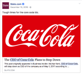
For our next test, we’ll look at a person who isn’t very recognizable and a very recognizable object. This experiment compares the performance of a post containing one of the most famous logos in the world, and one with the person who ran that company for years. Which do you think people responded to?
In this case, the object wins. The beloved logo of Coca-Cola outperformed the image of their former CEO, even though he is happily sipping on his very own Coke. Our suggestion is to consider the “fame factor” – go with what people know. Familiarity sparks interest.
From these tests, we can offer a few general guides to help you with your own optimization.
- Color photos generally outperform black and white images.
- People click on people, unless it’s a more famous logo or object.
- Your post text should be short, sweet and to the point – unlike this blog post.
If you want to learn how Keywee can help with your A/B testing and content distribution, request a demo here


