What is Data Storytelling (Dashboards, and Spreadsheets, and Graphs. Oh my!)
If you have a habit of getting your news online or prefer to stay up to date professionally through digital outlets, you’ve likely noticed at least one piece recently that uses data storytelling. While in itself nothing new, the developments that allow publishers to create stunning infographics, animations, interactive images, and multimedia pieces, have made data storytelling more common. At Keywee, we work with our partners to distribute their data-laced content to support various revenue streams; driving paying subscription sign-ups, growing their newsletter subscriber database, developing audiences, and even distributing branded content.
What is data storytelling? It’s the ability to get your point across using data tied up in a narrative. The data itself is likely valuable, but it might also be daunting to look at and unactionable. Think of your database as a box of beads. Each has its beauty, but only when you string them together can they be a useful necklace. The reason the storytelling aspect is so important is that the same data can be threaded with a different narrative and result in a completely different “necklace.”
Though it might sound like an interesting thing to do in theory, some of you might be asking if data storytelling is something you should be doing? Some topics are almost synonymous with it, such as economics and politics. But is this the right tool for an entertainment article? The answer is that it’s more dependent on the specific article, and not on the overall topic.
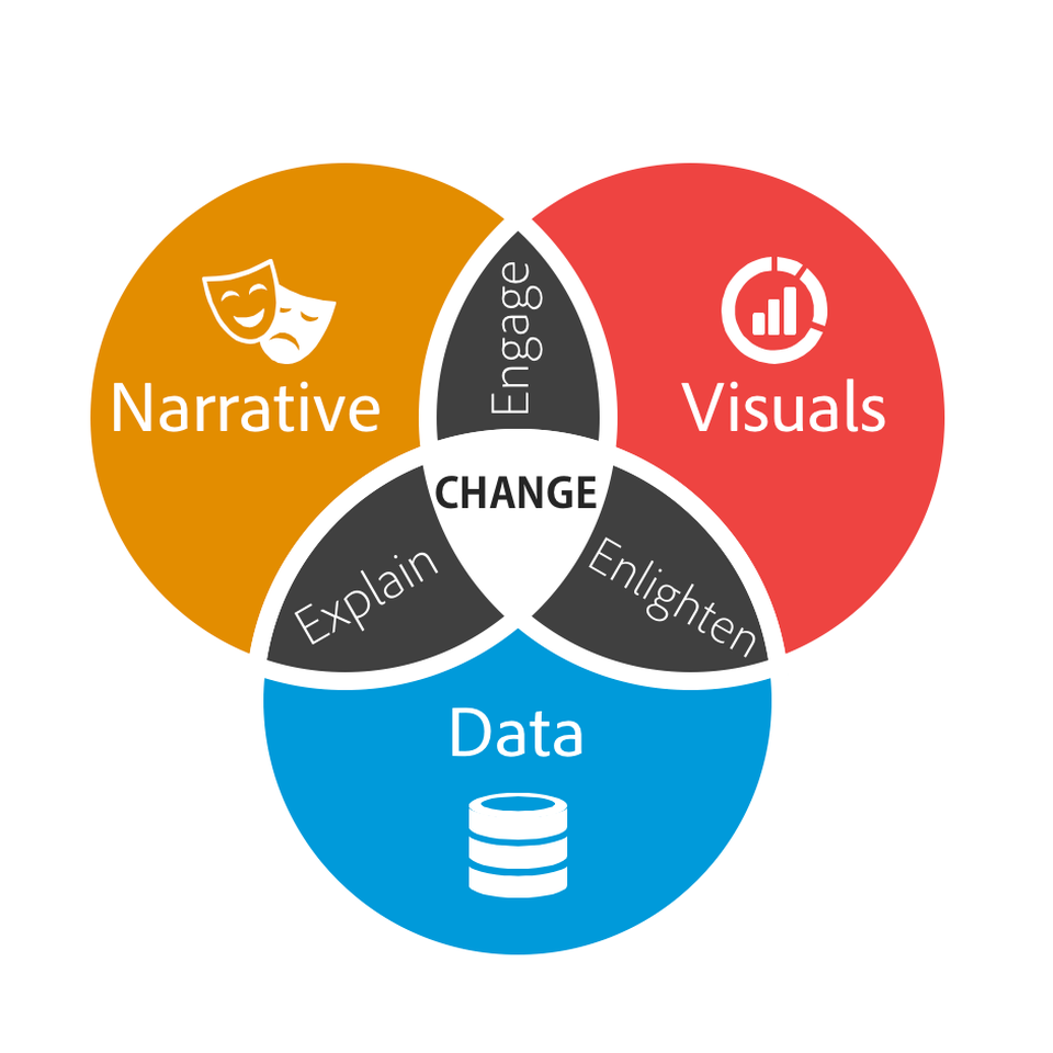
So why do people use it? One reason to consider using data storytelling is that it provides you with a lot of opportunities for micro-content. It can be broken down to different images and posts that can be used on social media as part of your broader content marketing strategy. Another reason is that it can be a very efficient tool to bring upon change. Whether it’s to change people’s opinion, help them understand new aspects of a subject matter, or drive people to take action, infusing a story with data is a good tool to have in your belt. The image below from Forbes is a great place to start the discussion. “When you combine the right visuals and narrative with the right data, you have a data story that can influence and drive change.”
Data independent from a narrative is hard to act on and difficult to remember. People remember stories better than dry data. If the data is disconnected from visuals, then it might also be hard to understand. A narrative that has beautiful visuals but no data is more of a comic book or a movie than an actionable piece.
Take this piece from Digiday, which talks about how publishers are using paid traffic from Facebook to achieve different goals, as a good example for data storytelling – the narrative is compelling and helps explain Keywee’s data, which is brought to the forefront with simple and coherent visuals.
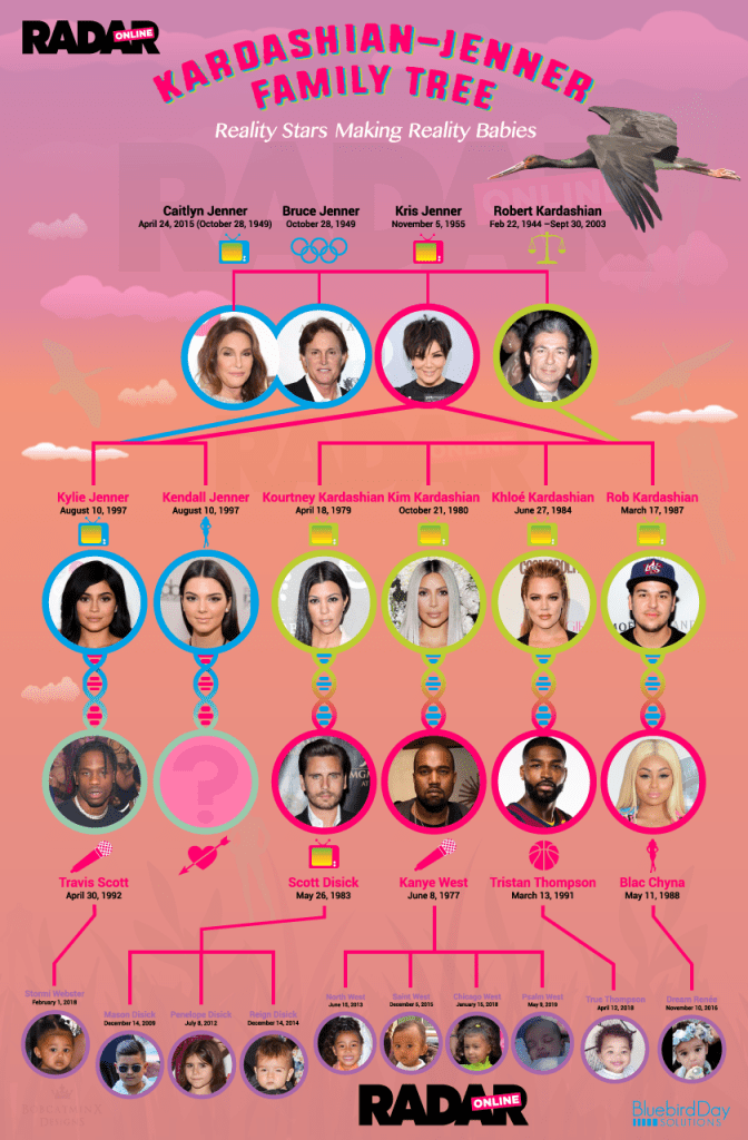
It’s common for financial publications such as Business Insider or Forbes, who try to help readers make sense of a large quantity of data, to use infographics in their data storytelling. But it’s not limited to finance. Publishers such as Variety, political foundations, and even entertainment magazines trying to keep up with the Kardashian’s family tree use infographics and other data-based visuals to get their point across.
All of these graphs and charts look great, but using data to give credibility to your story or using a story to make the data digestible didn’t come into being in the digital age. Infographics have been around since the 17th century. However, there has been an explosion in their popularity in recent decades as data distribution needs have increased and the general public is paying less and less attention to each piece of content.
Why use data storytelling?
We’ll be blunt about it: If you want people to remember what you have to say, you have to say it with a story that has a clear beginning, middle, and end. Your data has to make sense in a big picture kind of way because no one will remember a 40-slides-long powerpoint or a huge spreadsheet. Not even if you use a really cool graph.
Use your data to underpin your story and infuse it with credibility. The audience who reads your content wants you to help them connect the dots and blow their mind. If you’re a news publication, they want you to help make sense of the world and inform them with facts, preferably give them insights that can help them navigate through their day. And here lies the advantage of publishers – they can refine the data into insights, offering high value to readers in a short amount of time.
A great example of the distillation of information into nuggets of high value is the International Consortium of Investigative Journalists’ investigation of The Panama Papers. One person would have had a herculean task to go over the mass of information. Yet, the results of multiple journalists’ investigations culminated in public attention around the world and, subsequently, with monumental policy changes.
We can only assume that an article about tax havens would not have had the same response, and would not have been perceived as credible if it didn’t have the analyzed and researched data from the 11.5 million leaked papers to back it up. There’s a glut of content out there, and a lot of it can be fake. People want facts that prove your claims are true, especially if they are already your loyal readers. Credible data will make them more likely to trust your message and publication over time.
This interactive piece by the New York Times about New York City’s housing crisis is a great example of how thorough research helps to add credibility to a touching human story. The Times used publicly accessible data, such as court records, building permits, and several government databases, and also exclusive first-party data like interviews.
But what’s in it for brands, or anyone else with an online presence that isn’t a publisher? They aren’t held to the same journalistic standards and aren’t expected to always back their claims, so should they still use data storytelling as part of their content strategy? Simply put: absolutely yes!
Tying data and story together with a narrative can earn media and coverage (i.e free traffic) because it creates a distinction between you and your competitors. It also makes it easier for publishers to pick up and run your story without having to put a lot of resources into editing and verifying it. If your story is unique because of a proprietary database or a new point of view, that’s even better. Case in point, Spotify’s yearly reviews that are user-specific and tell a story of why Spotify’s service is relevant for that user. The data is something no other service could have provided to that user.
How are other publishers using data to tell a story?
Below are two examples from publishers that have been using data to tell a story and achieve different goals.
The Trace
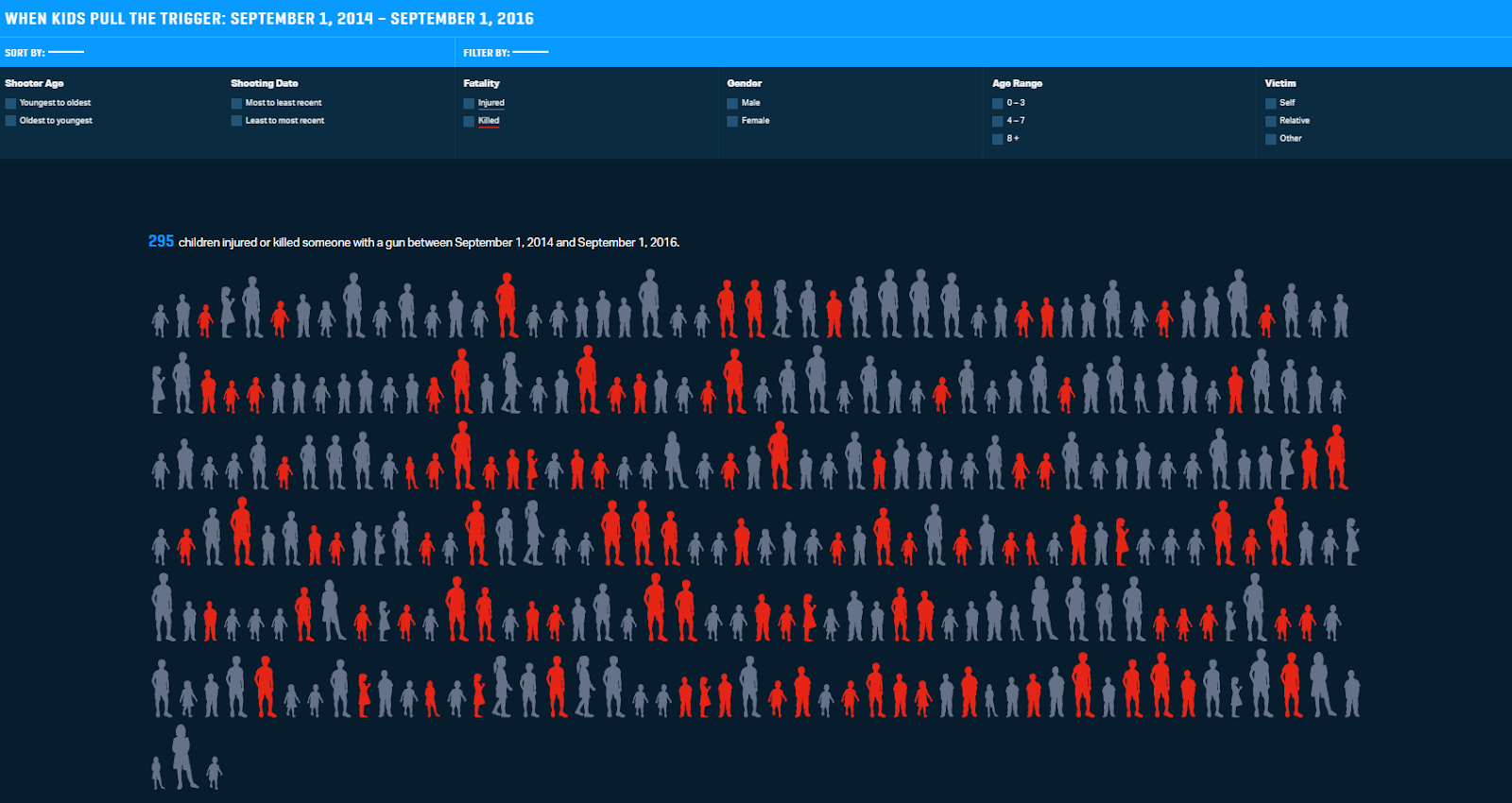
The non-profit is using data storytelling to raise awareness of gun violence in the US and promote action to change gun laws. Even though they don’t own the data they use, instead utilizing the Gun Violence Archive’s data, they create unique interactive infographics that help tell a story.
“We believe that when an issue is shrouded by a knowledge gap, journalism can be a big part of the solution.”
To bridge the knowledge gap that they see as an obstacle to solving the gun violence issue, The Trace is making the data accessible. In doing so, the publisher provides a great example that backs up this article’s many points:
- They claim they want to make a change to the gun laws in the US. That change will happen thanks to the public’s better understanding and grasp of the results of the gun violence that is made possible with current legislation.
- They provide a unique POV bundled with a narrative (despite not owning the data), making it more likely for other media outlets to pick up the story or use the data, and deliver earned media. Slate’s article, co-written with a reporter from The Trace, combined Slate’s storytelling experience and knowledge of their audience, with The Trace’s interactive map to make a point about gun violence in the US.
This list of partners also demonstrates the unique place a publisher’s D.N.A has as the skeleton of the storytelling process – despite having similar data and working together with writers from The Trace, each publication produced a distinct story.
What The Trace ended up creating is both visually stunning – see this interactive visualization and this map that Slate incorporated – and informative in a more traditional way.
Quartz
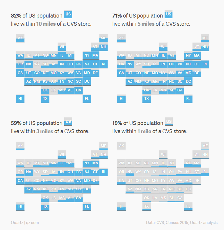
The media outlet uses data to uncover new stories and perspectives not often apparent on the surface. One of the most memorable pieces, in my opinion, is their analysis of Aetna’s acquisition of CVS. I’ve read many articles on why the acquisition made financial sense but Quartz’s article had two unique aspects that engraved it in my memory:
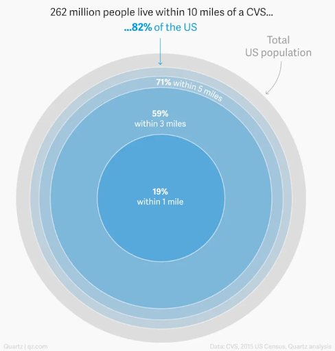
- It was the first articleI saw that analyzed the acquisition from a novel angle by using geographic data. Quartz’ analysis shows that a whopping 82% of the US population lives within a 10-mile radius of a CVS.
- The article also showed the data in two different formats that got me thinking for a while about the general inequality in services provided to rural communities in the US and other countries. Are there really so few CVS stores in Wyoming or Louisiana? This definitely stands out.
Quartz’s reporting has used so many ways to tell a story with data that the publisher even bundled some of the more innovative ways into one meta-article, which also includes this piece about the CVS acquisition.
Even at a glance, it’s easy to see the common themes that stand out in both The Trace and Quartz examples: the use of well-researched data to shed new light on topics covered by others while using credible and citable sources. They demonstrate the value of using data to tell a story, engage with audiences and make a compelling point. The combination of story, data, and visuals helps the stories be memorable, digestible, and in The Trace’s case, actionable.
After looking and what it means to use data to tell a better story, and examining how different publishers use it, it’s easy to see how this content strategy could be utilized for almost any revenue stream. It would be a perfect fit for subscription generation in particular that depends on proving your unique value.
Even with the same data, you can showcase your unique voice and value to your potential audience – after all, the same (data) beads on different (narrative) strings can create different necklaces. If you’d like to talk more about how we could help distribute your content to the right audiences, or if you need help scaling your current paid distribution efforts on Facebook, please reach out and request a demo.
